The new Duisburg store, which is owned by the Welke Group itself, forms part of a shopping centre designed for local use not far from the city centre. It has a retail area of 2 470 m2, which has been augmented by a 320 m2 outdoor area at the start of the garden pond season. The concept, which is intended to serve as a model for the other Welke stores, was formulated and implemented in collaboration with Jos de Vries. This company specialises in analysing retail formats throughout Europe and further developing and realising them. Customers of Jos de Vries include well-known retailing outfits such as Edeka and Globus (Germany), Migros (Switzerland) and Jumbo (Netherlands). They have recently been joined by specialist retail cooperative Sagaflor, which belongs to Welke and for which Jos de Vries has also created a new concept for the Zoo & Co. stores.
Focus on products
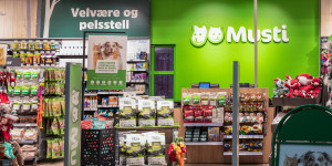
The store is located on two levels, extending over the entire ground floor and a 620 m2 gallery offering sufficient space for bulky accessories such as aquarium furniture, bird cages, small mammal cages and terrariums. “The product is the star,” says Welke managing director Thomas Brill of the new concept. Special lighting elements, special presentations and unusually designed shelf carriers are all intended to communicate the benefit and added value of the products more strongly yet subliminally to the customers.
The Welke Group has taken a conscious decision to focus the shopping experience on the products and not to base it on display elements. “You’ll look in vain here for event shopping in the sense of who has the biggest show aquarium in Germany,” comments Thomas Brill. Customers shouldn’t be awestruck when they enter the store – on the contrary, they should be inspired to shop. The simple, purposeful interior design, which nevertheless creates a fresh and modern impression, is striking. Here the colours grey and orange have been used, along with plenty of birch wood, to enhance the natural and authentic impact of the brand. “The entire building, both inside and outside, is moulded around the brand image,” explains Thomas Brill.
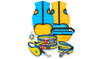
A placement system has been developed for pet food that accommodates approx. 20 per cent more merchandise than standard shelving. For high-quality product groups, suitably sophisticated forms of presentation have been chosen – for example, for collars and leads, clipping machines or elegant dog beds. The aim has also…

 Menü
Menü



 7-8/2009



 Newsletter