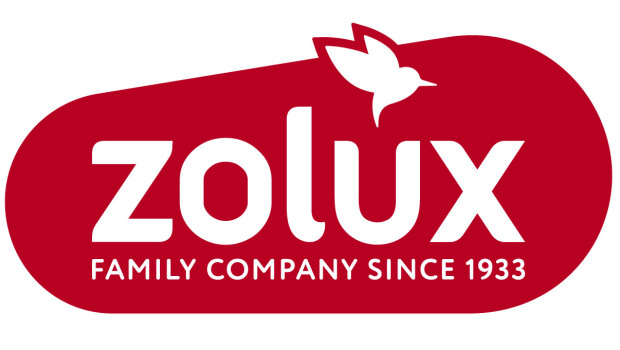
The French manufacturer Zolux has redesigned its brand image. The new logo still features the brand’s iconic red colour, but in a more modern, sophisticated tone. The round shapes have been retained to emphasise the warm aspect of Zolux, but the logo has a more dynamic shape and a new emblem: the hummingbird.
“The hummingbird refers to our origins, the seed shop that opened in 1933, and is a strong symbol of kindness, hope, generosity, courage and optimism,” the company reports. It also symbolises the company’s commitment to environmental protection. Lower-case letters were also chosen for the brand name to make it more familiar, and the words “Family company since 1933” were used to emphasise the brand’s history and expertise.
The packaging and product segmentation were also revised to standardise the brand in shops and make it clearer for customers.

 Menü
Menü




 Print - digital - online